24. Angular Material
- Material Design Components Optimized For Angular
- Library of high quality UI Components for Angular
- Internationalized, Clean and Simple API, Customizable, Well Tested, Fast
- Well Documented https://material.angular.io/
- Based on Material Design Language developed by Google since 2014
Install:
npm install --save @angular/material @angular/cdk hammerjs
Styles CSS include a prebuilt-theme:
@import "~@angular/material/prebuilt-themes/indigo-pink.css";
Material Module:
import { NgModule } from '@angular/core';
import {
  MatAutocompleteModule,
  MatButtonModule,
  MatRadioModule,
  MatCardModule,
  MatCheckboxModule,
  MatDatepickerModule,
  MatFormFieldModule,
  MatIconModule,
  MatInputModule,
  MatListModule,
  MatSelectModule,
  MatSidenavModule,
  MatSliderModule,
  MatSlideToggleModule,
  MatStepperModule,
  MatToolbarModule
} from '@angular/material';

@NgModule({
  imports: [
    MatAutocompleteModule,
    MatButtonModule,
    MatRadioModule,
    MatCardModule,
    MatCheckboxModule,
    MatDatepickerModule,
    MatFormFieldModule,
    MatIconModule,
    MatInputModule,
    MatListModule,
    MatSelectModule,
    MatSidenavModule,
    MatSliderModule,
    MatSlideToggleModule,
    MatStepperModule,
    MatToolbarModule
  ],
  exports: [
    MatAutocompleteModule,
    MatButtonModule,
    MatRadioModule,
    MatCardModule,
    MatCheckboxModule,
    MatDatepickerModule,
    MatFormFieldModule,
    MatIconModule,
    MatInputModule,
    MatListModule,
    MatSelectModule,
    MatSidenavModule,
    MatSliderModule,
    MatSlideToggleModule,
    MatStepperModule,
    MatToolbarModule
  ]
})
export class AppMaterialModule { }
AppModule:
import { NgModule } from '@angular/core';
import { BrowserModule } from '@angular/platform-browser';
import { BrowserAnimationsModule } from '@angular/platform-browser/animations';

import { AppMaterialModule } from './app-material.module';

import { FormsModule } from '@angular/forms';
import { AppComponent } from './app.component';
import { PrincessComponent } from './princess.component';


@NgModule({
  declarations: [
    AppComponent,
    PrincessComponent
  ],
  imports: [
    BrowserModule,
    BrowserAnimationsModule,
    FormsModule,
    AppMaterialModule
  ],
  providers: [],
  bootstrap: [ AppComponent ]
})
export class AppModule { }
Main:
import { enableProdMode } from '@angular/core';
import { platformBrowserDynamic } from '@angular/platform-browser-dynamic';
import 'hammerjs';
import { AppModule } from './app/app.module';
import { environment } from './environments/environment';

if (environment.production) {
  enableProdMode();
}

platformBrowserDynamic().bootstrapModule(AppModule);
index:
<!doctype html>
<html lang="en">
<head>
  <meta charset="utf-8">
  <title>ng5-tour-of-technologies</title>
  <base href="/">
  <meta name="viewport" content="width=device-width, initial-scale=1">
  <link rel="icon" type="image/x-icon" href="favicon.ico">
  <link href="https://fonts.googleapis.com/css?family=Ubuntu:400,500,700" rel="stylesheet">
  <link href="https://fonts.googleapis.com/icon?family=Material+Icons" rel="stylesheet">
</head>
<body>
  <app-root></app-root>
</body>
</html>
Checkboxes:
import { Component } from '@angular/core';


@Component({
  selector: 'app-root',
  template: `
          <mat-toolbar color="primary">
            <button (click)="sidenav.toggle()" mat-mini-fab><mat-icon>menu</mat-icon></button>
            <span class="fill-remaining-space"></span>
            <span>
                Angular 5 Tour Of Technologies
            </span>
          </mat-toolbar>
      <mat-sidenav-container>
        <mat-sidenav #sidenav mode="side" class="app-sidenav">
          <p>Sidenav Content here</p>
        </mat-sidenav>
        <div class="app-content">
            <mat-checkbox
              #myCheckbox
              [value]="1"
              [checked]="isChecked"
              (change)="onChange($event)"> Show Me Your Secrets!</mat-checkbox>
              <div *ngIf="myCheckbox.checked">
                The will to win is nothing without the will to prepare ...
              </div>
          <app-princess></app-princess>
        </div>
      </mat-sidenav-container>
  `,
  styles: [`
    :host {
      display: flex;
      flex-direction: column;
      flex: 1;
    }
    `]
})
export class AppComponent {
  title = 'Tour of Technologies';
  isChecked = true;
  onChange(event) {
    console.log(event);
  }

}
Let's view the Material Design Look and Feel in our Chromium Web Browser:

import { Component } from '@angular/core';


@Component({
  selector: 'app-root',
  template: `
          <mat-toolbar color="primary">
            <button (click)="sidenav.toggle()" mat-mini-fab><mat-icon>menu</mat-icon></button>
            <span class="fill-remaining-space"></span>
            <span>
                Angular 5 Tour Of Technologies
            </span>
          </mat-toolbar>
      <mat-sidenav-container>
        <mat-sidenav #sidenav mode="side" class="app-sidenav">
          <p>Sidenav Content here</p>
        </mat-sidenav>
        <div class="app-content">
            <mat-radio-group class="sample-radio-group" [(ngModel)]="favoriteTechnology">
              <mat-radio-button class="sample-radio-button" *ngFor="let technology of technologies" [value]="technology">
                {{ technology }}
              </mat-radio-button>
            </mat-radio-group>
            <div class="sample-selected-value">Your favorite technology is: {{ favoriteTechnology}}</div>
          <app-princess></app-princess>
        </div>
      </mat-sidenav-container>
  `,
  styles: [`
    :host {
      display: flex;
      flex-direction: column;
      flex: 1;
    }
    .sample-radio-group {
      display: inline-flex;
      flex-direction: column;
    }
    .sample-radio-button {
      margin: 5px;
    }
    .sample-selected-value {
      margin: 15px 0;
    }
    `]
})
export class AppComponent {
  title = 'Tour of Technologies';
  technologies = ['Angular 5', 'Angular CLI 1.5',
                  'Angular Material 5', 'Firebase', 'Google Cloud Platform'];

}
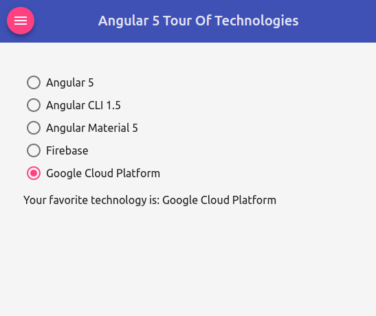
Let's view the results in Chromium:
AutocompleteComponent:
import { Component } from '@angular/core';
import { FormControl } from '@angular/forms';

import { Observable } from 'rxjs/Observable';
import 'rxjs/add/operator/startWith';
import 'rxjs/add/operator/map';

@Component({
  selector: 'app-autocomplete',
  template: `
            <form class="sample-form">
                <mat-form-field class="sample-full-width">
                <input matInput placeholder="Country" aria-label="Country"
                [matAutocomplete]="auto" [formControl]="countryCtrl">
                <mat-autocomplete #auto="matAutocomplete">
                  <mat-option *ngFor="let country of filteredCountries | async" [value]="country.name">
                    <img style="vertical-align:middle" aria-hidden src="{{ country.flag}}" height="25">
                    <span> {{ country.name }} </span>
                    <small>Capital: {{ country.capital }}</small>
                  </mat-option>
                </mat-autocomplete>
                </mat-form-field>
                <br>
                <mat-slide-toggle [checked]="countryCtrl.disabled"
                (change)="countryCtrl.disabled ? countryCtrl.enable() : countryCtrl.disable()">
                  Disable Input ?
                </mat-slide-toggle>
            </form>
  `,
  styles: [`
        .sample-form {
          min-width: 150px;
          max-width: 500px;
          width: 100%;
        }
        .sample-full-width {
          width: 100%;
        }
    `]
})
export class AutocompleteComponent {
  countryCtrl: FormControl;
  filteredCountries: Observable<any[]>;

  countries: any[] = [
      {
        name: 'Germany',
        capital: 'Berlin',
        flag: 'https://upload.wikimedia.org/wikipedia/en/b/ba/Flag_of_Germany.svg'
      },
      {
        name: 'Japan',
        capital: 'Tokyo',
        flag: 'https://upload.wikimedia.org/wikipedia/en/9/9e/Flag_of_Japan.svg'
      },
      {
        name: 'Netherlands',
        capital: 'The Hague',
        flag: 'https://upload.wikimedia.org/wikipedia/commons/2/20/Flag_of_the_Netherlands.svg'
      },
      {
        name: 'USA',
        capital: 'Washington D.C.',
        flag: 'https://upload.wikimedia.org/wikipedia/en/a/a4/Flag_of_the_United_States.svg'
      }
  ];

  constructor() {
    this.countryCtrl = new FormControl();
    this.filteredCountries = this.countryCtrl.valueChanges
                    .startWith(null)
                    .map(country => country ? this.filterCountries(country) : this.countries.slice());
  }

  filterCountries(name: string) {
    return this.countries.filter(country =>
                country.name.toLowerCase().indexOf(name.toLowerCase()) === 0);
  }

}
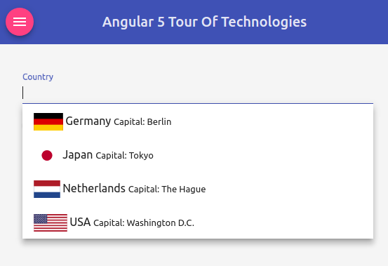
Let's view the running app in our Browser:
DatepickerComponent:
import { Component, ViewEncapsulation } from '@angular/core';
import { MAT_MOMENT_DATE_FORMATS, MomentDateAdapter } from '@angular/material-moment-adapter';
import { DateAdapter, MAT_DATE_FORMATS, MAT_DATE_LOCALE } from '@angular/material/core';

@Component({
  selector: 'app-datepicker',
  template: `
            <mat-form-field>
              <input matInput [matDatepicker]="datePicker" placeholder="Pick a date">
              <mat-datepicker-toggle matSuffix [for]="datePicker"></mat-datepicker-toggle>
              <mat-datepicker #datePicker></mat-datepicker>
            </mat-form-field>
            <button mat-raised-button color="warn" (click)="american()">
            Dynamic switch to American
            </button>
  `,
  providers: [
              { provide: MAT_DATE_LOCALE, useValue: 'de-DE' },
              { provide: DateAdapter, useClass: MomentDateAdapter, deps: [MAT_DATE_LOCALE] },
              { provide: MAT_DATE_FORMATS, useValue: MAT_MOMENT_DATE_FORMATS }
            ],
  styles: [`.mat-calendar { width: 435px !important; height: 493px !important; }`],
  encapsulation: ViewEncapsulation.None
})
export class DatepickerComponent {
  constructor(private adapter: DateAdapter<any>) { }

  american() {
    this.adapter.setLocale('en');
  }

}
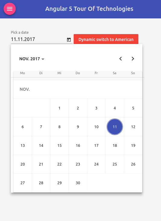
Let's view the results in Chromium:
import { Component } from '@angular/core';


@Component({
  selector: 'app-formfields',
  template: `
          <div class="sample-container">
                <mat-form-field>
                  <input matInput placeholder="What is your name?">
                </mat-form-field>
                <mat-form-field>
                  <textarea matInput placeholder="Describe yourself in 3 words ..."></textarea>
                </mat-form-field>
                <mat-form-field>
                  <mat-select placeholder="Pick your technology">
                    <mat-option *ngFor="let technology of technologies" [value]="technology">
                    {{ technology }}
                    </mat-option>
                  </mat-select>
                </mat-form-field>
          </div>
  `,
  styles: [`
        .sample-container { display: flex; flex-direction: column; }
        .sample-container > * { width: 20%; }
    `]
})
export class FormFieldsComponent {
    technologies = ['Angular 5', 'Angular CLI 1.5', 'Angular Material 5', 'Firebase'];

}
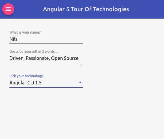
Let's view the results in our Browser:
import { Component } from '@angular/core';

@Component({
  selector: 'app-input',
  template: `
        <form class="sample-form">
            <mat-form-field class="sample-full-width">
                  <input matInput placeholder="Favorite technology" value="Angular 5">
            </mat-form-field>
            <mat-form-field class="sample-full-width">
                  <textarea matInput placeholder="Evaluate me ..."></textarea>
            </mat-form-field>
        </form>
  `,
  styles: [`
          .sample-form {
            min-width: 150px;
            max-width: 400px;
            width: 100%;
          }
          .sample-full-width {
            width: 100%;
          }
    `]
})
export class InputComponent { }
Let's have a look at the results in Chromium:

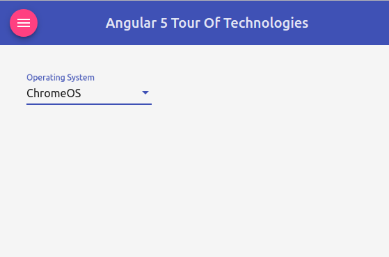
SelectComponent:
import { Component, ViewEncapsulation } from '@angular/core';
import { FormControl } from '@angular/forms';

@Component({
  selector: 'app-select',
  template: `
        <mat-form-field>
                <mat-select placeholder="Operating System" [formControl]="osColor"
                  panelClass="sample-panel-{{osColor.value}}">
                  <mat-option value="red">Linux</mat-option>
                  <mat-option value="green">ChromeOS</mat-option>
                  <mat-option value="blue">macOS/X</mat-option>
                </mat-select>
        </mat-form-field>
  `,
  styles: [`
          .sample-panel-red .mat-select-content { background: rgba(255, 0, 0, 0.5); }
          .sample-panel-green .mat-select-content { background: rgba(0, 255, 0, 0.5); }
          .sample-panel-blue .mat-select-content { background: rgba(0, 0, 255, 0.5); }
    `],
    encapsulation: ViewEncapsulation.None
})
export class SelectComponent {
    osColor = new FormControl('red');

}
Let's view the results in Chromium:
SliderComponent:
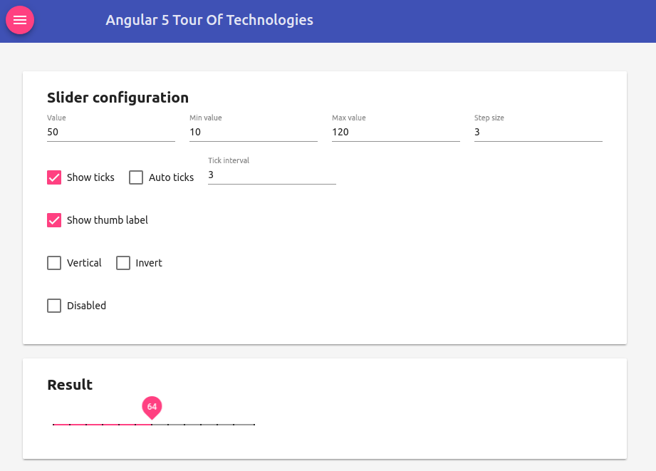
import { Component } from '@angular/core';

@Component({
  selector: 'app-slider',
  template: `
            <mat-card>
                <mat-card-content>
                <h2 class="sample-h2">Slider configuration</h2>
                <section class="sample-section">
                <mat-form-field class="sample-margin">
                  <input matInput type="number" placeholder="Value" [(ngModel)]="value">
                </mat-form-field>
                <mat-form-field class="sample-margin">
                  <input matInput type="number" placeholder="Min value" [(ngModel)]="min">
                </mat-form-field>
                <mat-form-field class="sample-margin">
                  <input matInput type="number" placeholder="Max value" [(ngModel)]="max">
                </mat-form-field>
                <mat-form-field class="sample-margin">
                  <input matInput type="number" placeholder="Step size" [(ngModel)]="step">
                </mat-form-field>
                </section>
                <section class="sample-section">
                  <mat-checkbox class="sample-margin" [(ngModel)]="showTicks">Show ticks</mat-checkbox>
                  <mat-checkbox class="sample-margin" [(ngModel)]="autoTicks" *ngIf="showTicks">
                  Auto ticks
                  </mat-checkbox>
                  <mat-form-field class="sample-margin" *ngIf="showTicks && !autoTicks">
                      <input matInput type="number" placeholder="Tick interval" [(ngModel)]="tickInterval">
                  </mat-form-field>
                </section>
                <section class="sample-section">
                  <mat-checkbox class="sample-margin" [(ngModel)]="thumbLabel">Show thumb label</mat-checkbox>
                </section>
                <section class="sample-section">
                  <mat-checkbox class="sample-margin" [(ngModel)]="vertical">Vertical</mat-checkbox>
                  <mat-checkbox class="sample-margin" [(ngModel)]="invert">Invert</mat-checkbox>
                </section>
                <section class="sample-section">
                  <mat-checkbox class="sample-margin" [(ngModel)]="disabled">Disabled</mat-checkbox>
                </section>
                </mat-card-content>
            </mat-card>
            <mat-card class="result">
                <mat-card-content>
                <h2 class="sample-h2">Result</h2>
                <mat-slider
                class="sample-margin"
                [disabled]="disabled"
                [invert]="invert"
                [max]="max"
                [min]="min"
                [step]="step"
                [thumb-label]="thumbLabel"
                [tick-interval]="tickInterval"
                [value]="value"
                [vertical]="vertical">
                </mat-slider>
                </mat-card-content>
            </mat-card>
  `,
  styles: [`
        .sample-h2 {
          margin: 10px;
        }
        .sample-section {
          display: flex;
          align-content: center;
          align-items: center;
          height: 60px;
        }
        .sample-margin {
          margin: 10px;
        }
        .mat-slider-horizontal {
          width: 300px;
        }
        .mat-slider-vertical {
          height: 300px;
        }
        .mat-card {
          width: 800px;
        }
    `]
})
export class SliderComponent {
      private _tickInterval = 1;
      autoTicks = false;
      disabled = false;
      invert = false;
      max = 100;
      min = 0;
      showTicks = false;
      step = 1;
      thumbLabel = false;
      value = 0;
      vertical = false;

      get tickInterval(): number | 'auto' {
        return this.showTicks ? (this.autoTicks ? 'auto' : this._tickInterval) : 0;
      }
      set tickInterval(val) {
        this._tickInterval = Number(val);
      }

}
Let's have a look at this baby in our Chromium Browser:
SlideToggle:
import { Component } from '@angular/core';


@Component({
  selector: 'app-root',
  template: `
          <mat-toolbar color="primary">
            <button (click)="sidenav.toggle()" mat-mini-fab><mat-icon>menu</mat-icon></button>
            <span class="fill-remaining-space"></span>
            <span>
                Angular 5 Tour Of Technologies
            </span>
          </mat-toolbar>
      <mat-sidenav-container>
        <mat-sidenav #sidenav mode="side" class="app-sidenav">
          <p>Sidenav Content here</p>
        </mat-sidenav>
        <div class="app-content">
        <div>
          <mat-slide-toggle>Slide me</mat-slide-toggle>
        </div>
          <app-princess></app-princess>
        </div>
      </mat-sidenav-container>
  `,
  styles: [`
    :host {
      display: flex;
      flex-direction: column;
      flex: 1;
    }
    `]
})
export class AppComponent {
  title = 'Tour of Technologies';

}
Let's view the results in our Browser:
